基于 Bootstrap + Vue 框架编写模态框组件并完成文章删除功能
在上篇教程中,学院君已经给大家演示了如何通过 Laravel + Vue 快速实现文章发布、编辑和浏览(包括列表和详情页)功能,今天我们再来实现文章删除功能。
由于后端删除接口已经在上篇教程中提供了,所以这里专注前端组件和功能即可。
基于浏览器对话框快速实现
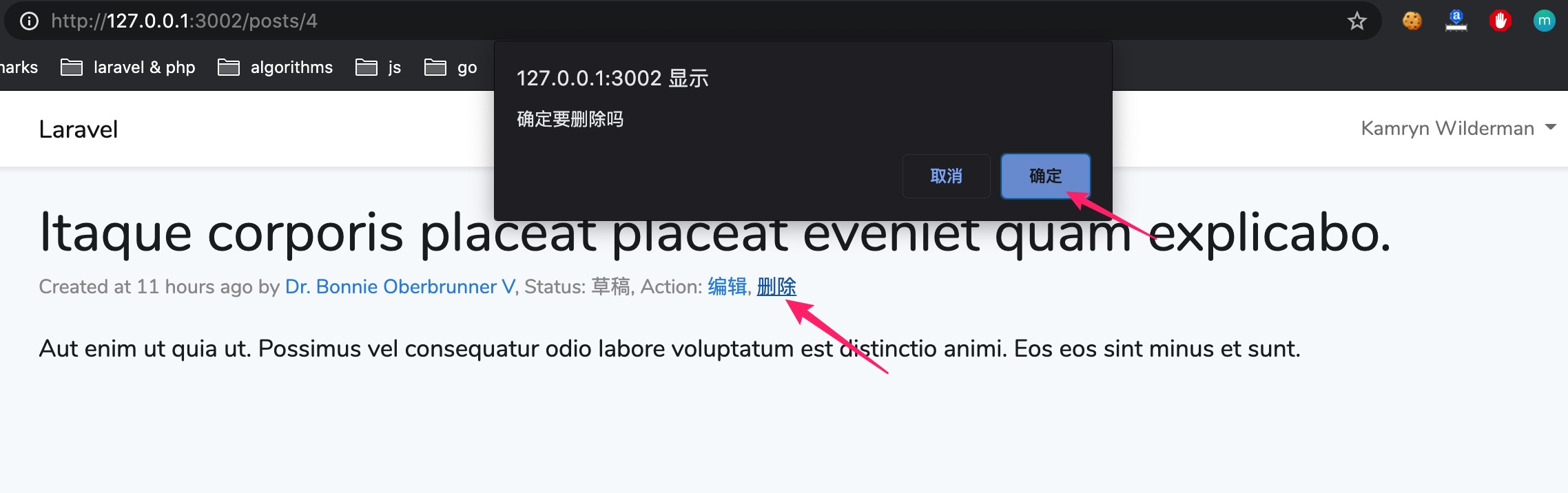
首先,我们基于 JavaScript confirm 方法弹出的浏览器自带对话框窗口快速实现文章删除。打开 PostDetail 组件所在文件,新增如下代码:
...

<p class="post-meta">
    ...
    Action: <a :href="'/posts/' + id + '/edit'">编辑</a>,
            <a href="#" @click="showDeleteDialog">删除</a>
</p>

...

methods: {
    ...

    showDeleteDialog() {
        if (confirm('确定要删除吗')) {
            axios.delete('/posts/' + Number(this.id)).then(resp => {
                if (resp.data.success === true) {
                    // 删除成功跳转到文章列表页
                    window.location.href = '/posts';
                } else {
                    alert(resp.data.message);
                }
            })
        }
    }
}

...
在上述组件代码中,我们在 HTML 模板中添加了删除链接,点击该链接会触发 showDeleteDialog 函数,我们在 Vue 组件的方法列表中实现这个方法,在该方法体中,如果用户在通过 confirm 方法弹出的浏览器自带对话框窗口中点击了「确认」按钮,confirm 方法会返回 true,然后我们就可以根据这个条件发送删除文章请求,执行删除操作,删除成功后,页面会重定向到文章列表页:
这样虽然可以完成需求,但是这个对话框窗口有点简陋,既然我们使用了 Bootstrap CSS 框架,是否可以将 Bootstrap 框架提供的模态框组件集成进来呢?
当然可以。
引入 Bootstrap 模态框实现
我们以 Static backdrop 这个示例模态框为例进行演示。在 resources/js/components 目录下新建一个 ConfirmModal.vue 单文件组件,将这个示例模态框的模态框部分 HTML 代码拷贝到 ConfirmModal.vue 的模板代码中:
<style scoped>

</style>

<template>
<!-- Modal -->
<div class="modal fade" :id="target" data-backdrop="static" data-keyboard="false" tabindex="-1" aria-labelledby="staticBackdropLabel" aria-hidden="true">
    <div class="modal-dialog">
        <div class="modal-content">
            <div class="modal-header">
                <h5 class="modal-title" id="staticBackdropLabel">
                    <slot name="title"></slot>
                </h5>
                <button type="button" class="close" data-dismiss="modal" aria-label="Close">
                    <span aria-hidden="true">×</span>
                </button>
            </div>
            <div class="modal-body">
                <slot></slot>
            </div>
            <div class="modal-footer">
                <button type="button" class="btn btn-secondary" data-dismiss="modal">取消</button>
                <button type="button" class="btn btn-primary" @click="$emit('delete')">确定</button>
            </div>
        </div>
    </div>
</div>
</template>

<script>
export default {
    props: ['target'],
}
</script>
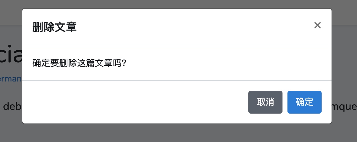
将硬编码的 HTML 文本通过插槽转发给父级作用域传入,在点击确定按钮时设置触发父级作用域的 delete 事件,将模态框最外层的 id 属性调整为动态属性绑定,以便与父级作用域建立关联,进而可以从父级作用域通过点击删除链接弹出这个模态框,这里的父级作用域就是文章详情页对应的 PostDetail 组件。
点开 PostDetail 组件对应文件,将删除链接属性调整为与 Static backdrop 模态框示例代码中点开模态框的按钮属性一致,然后在这个组件中引入 ComfirmModal 组件,并且在该组件上设置 @delete 属性监听子组件点击「确定」按钮事件:
<template>
    ...
            Action: <a :href="'/posts/' + id + '/edit'">编辑</a>,
                    <a href="#" data-toggle="modal" data-target="#staticBackdrop">删除</a>
        </p>
        <div class="post-content">
            {{ content }}
        </div>
        <confirm-modal target="staticBackdrop" @delete="deleteThisPost">
            <template #title>删除文章</template>
            确定要删除这篇文章吗?
        </confirm-modal>
    </div>
</template>

<script>
import ConfirmModal from "./ConfirmModal";
export default {
    components: {ConfirmModal},

    ...

    methods: {

        ...

        deleteThisPost() {
            axios.delete('/posts/' + Number(this.id)).then(resp => {
                if (resp.data.success === true) {
                    // 删除成功跳转到文章列表页
                    window.location.href = '/posts';
                } else {
                    alert(resp.data.message);
                }
            })
        }
    }
}
</script>
如果触发了 delete 事件则执行 deleteThisPost 方法发起删除文章请求删除该文章。另外,在 confirm-modal 组件属性上还传递了 target 属性到子组件,这样一来,点击删除按钮,就可以弹出确认删除的模态框:
同样点击「确定」就可以完成删除文章操作。
自行实现模态框的打开和关闭
上面的实现从用户角度看已经没什么问题了,但是还有进一步优化的空间:现在的模态框弹出功能和渲染逻辑是基于 Bootstrap 定义的机制实现的,需要定义很多不知所云的属性确保模态框可以正常弹出和关闭,如果我们需要在模态框弹出或关闭的时候进行一些自定义的操作,比如设置过渡效果、监听打开和关闭事件,就会很棘手。
为此,我们可以完全删除这些自带模态框属性,自行实现模态框的打开和关闭功能。
其实很简单,我们在 PostDetail 中新增一个 showDeleteModal 属性来控制模态框的显示与隐藏:
...
            Action: <a :href="'/posts/' + id + '/edit'">编辑</a>,
                    <a href="#" @click="showDeleteModal = !showDeleteModal">删除</a>
        </p>
        ...
        <confirm-modal @do-action="deleteThisPost" @hide-modal="showDeleteModal = !showDeleteModal" :show-modal="showDeleteModal">
            <template #title>删除文章</template>
            确定要删除这篇文章吗?
        </confirm-modal>
    ...
export default {
    ...
    data() {
        return {
            ...
            showDeleteModal: false
        }
    },

...
该模型属性的值通过点击删除链接进行切换,默认是 false,表示模态框不显示,点击删除链接后,就变成 true,再沿着 props 属性 show-modal 传递给 ConfirmModal 组件。在引入 ConfirmModal 组件进行渲染的地方,将原来的 delete 事件属性名调整为了 do-action 事件以扩展模态框组件的通用性,然后新增了一个 hide-modal 事件,用于监听模态框组件的关闭模态框事件,将 showDeleteModal 属性值切换回 false。
在这里我们已经移除了 target 属性以及删除链接上原来为了遵循 Bootstrap 打开模态框的机制而设置的属性。
在 ConfirmModal 中,
<style scoped>
.confirm-modal {
    position: fixed;
    top: 0;
    left: 0;
    z-index: 1050;
    width: 100%;
    height: 100%;
    overflow: hidden;
    outline: 0;
}
.confirm-modal-backdrop {
    position: fixed;
    top: 0;
    left: 0;
    z-index: 1040;
    width: 100vw;
    height: 100vh;
    background-color: #000;
    opacity: .5;
}
</style>

<template>
    <!-- Modal -->
    <div v-show="showModal">
        <div class="confirm-modal">
            <div class="modal-dialog">
                <div class="modal-content">
                    <div class="modal-header">
                        <h5 class="modal-title">
                            <slot name="title"></slot>
                        </h5>
                        <button type="button" class="close" @click="$emit('hide-modal')">
                            <span aria-hidden="true">×</span>
                        </button>
                    </div>
                    <div class="modal-body">
                        <slot></slot>
                    </div>
                    <div class="modal-footer">
                        <button type="button" class="btn btn-secondary" @click="$emit('hide-modal')">取消</button>
                        <button type="button" class="btn btn-primary" @click="$emit('do-action')">确定</button>
                    </div>
                </div>
            </div>
        </div>
        <div class="confirm-modal-backdrop"></div>
    </div>
</template>

<script>
export default {
    props: ['showModal'],
}
</script>
移除掉了模态框最外层之前的一大堆属性,并且将类名调整为 confirm-modal 以免受 Bootstrap 框架模态框机制的干扰,与模态框元素同级新增了一个 <div class="modal-backdrop"></div> 容器,用于处理模态框的蒙层。
现在模态框的显示与否完全基于最外层的 v-show="showModal" 条件是否满足,两个关闭模态框的地方也移除了原来的 data-dismiss="modal" 属性,调整为触发父级作用域定义的 hide-modal 事件。「确定」按钮的点击事件也调整为触发父级的 do-action 事件进行文章删除操作。
最后,我们在 style 中为模态框及蒙层定义了 CSS 样式(完全兼容之前的 Bootstrap CSS 代码)。
再次回到文章详情页,点击「删除」链接,可以看到可以正常打开模态框,并且渲染效果和之前一模一样:
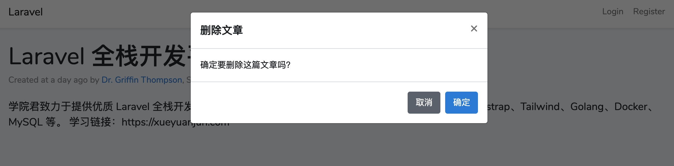
点击「取消」或者右上角的「x」也可以正常关闭模态框。
此时没有登录,所以是无法删除文章的,你可以在登录之后进行确认删除操作,功能也是完全正常的,至此,除了 CSS 代码之外,这个模态框的打开关闭已经完全在我们的掌控之下了,下篇教程,学院君就来给大家演示如何为模态框的打开和关闭添加 Vue 框架提供的动画/过渡效果。
无评论